Introduction
The OnePlus 6: still a top notch deal? If so, is that despite or maybe even thanks to its top notch? On the surface, it definitely seems like this is a worthy contender in the flagship realm even today, with its glass back, minimal bezels, and top of the line internals for 2018.
The OnePlus One was the 'flagship killer' four years ago, with its high-end specs and crazy price. In the meantime, OnePlus' journey has altered its products somewhat, but since 2014 the company has consistently put out some of the most interesting handsets of each year. The OnePlus 6 represents the culmination of its work in making devices that are more affordable than their competitors while sacrificing less and less to achieve that with every year that goes by.
The price, however, has been keeping up with the improvements in every new OnePlus phone, and the OnePlus 6 is the most expensive model ever launched by the company. Over time it has basically gone from selling cheap flagships to selling cheaper flagships than the competition. The distinction is subtle, but it's there.
Join us over the next pages of this long-term review in order to find out whether that makes the OnePlus 6 a true spiritual successor to the original OnePlus One. We'll tell you what it was like to live with the OnePlus 6 day in and day out for an extended period of time, during which we've used it as our one and only smartphone. Is it worth the asking price? Do its performance and smoothness match those of other flagships? Let's find out.
Display
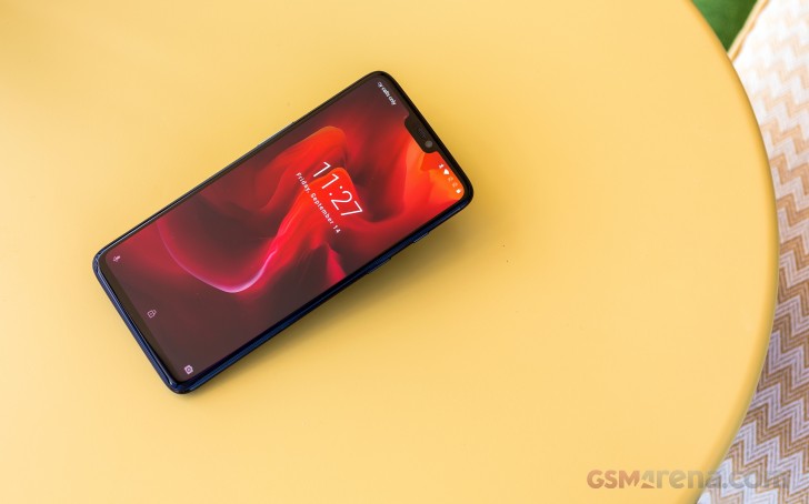
The notch is everywhere this year, so it's also on the OnePlus 6. Smaller than others, but still distinctively there. It's paired with a tiny but not invisible chin at the other end of the display, and almost nonexistent side bezels.
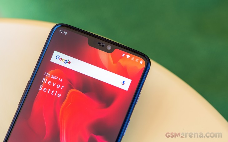
If you hate screen cutouts, the good news here is that you can 'hide' the OnePlus 6's notch in software. That works very well since the phone has an AMOLED display panel, so the deep black background for the notification area on either side of the notch fools your eyes into thinking there is no cutout, to begin with. Of course, if you like the look of the 'ears' or 'horns' as some call them, you can keep them, no one's going to judge you (hopefully).
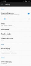

Hiding the notch in Display settings
This phone continues the OnePlus tradition of not choosing the highest-res panel possible. So it has to make do with 1080x2280 resolution, but that's very much a non-issue in day to day use. The screen looks very good and sharp, and unless you have really amazing eyesight, it's unlikely you'll be able to see individual pixels.
Not opting for 1440 horizontal pixels was clearly a cost-cutting move on OnePlus' part, though it also probably helps a tad with battery life. And don't forget that we live in a day and age in which Samsung's flagships have 1440x2960 screens but by default, they're set at to run at 1080x2220.
When it comes to color accuracy, the default profile isn't your friend, though it does have a vivid look with its bluish whites and saturated colors. Thankfully, you can opt for sRGB or DCI-P3 calibration modes, which are very accurate to their respective targets.
It's good to see that the display panel supports the DCI-P3 color gamut even at such an affordable price point. If you want a personalized color temperature, the Custom color preset in Screen calibration settings gives you a Cold-to-Warm slider which you can move to your heart's desire, in order to find what best works for you.


Color profiles
In bright sunlight, the OnePlus 6's screen remains visible, even if it's not the champion in this regard. Its predecessor, the OnePlus 5T, fared better. It's strange to see a newer model being outperformed by an older one in any metric, but to be fair the OnePlus 6 isn't substantially worse. When the sun directly hits the screen, the experience of using the phone won't be a very comfortable one, but at least it is workable.
Auto-brightness does its thing well for the most part, but we wish it would learn from your manual adjustments like Samsung's and Google's do. There's also no boost or overdrive when in auto mode - the brightness maxes out at the rightmost end of the slider and that's it. This is an area that future OnePlus devices should bring improvements to.
Anyway, the OnePlus 6 does have a good top brightness level, even if it doesn't feel as bright as some of its more expensive competitors. Make sure to check out our lab test results in the OnePlus 6 review to get a better picture of how its maximum brightness compares to other handsets'.
Design, build
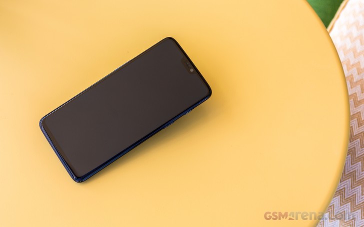
The OnePlus 6 sure looks modern, in that it adopts the still very trendy sandwich design, with a metal frame and glass both on the front as well as the rear. Its 83.8% screen-to-body ratio adds to that perception, even though it isn't class-leading.
Midnight Black is the color of our review unit, and it comes with an understated yet elegant matte-like finish on the back. One that you can easily mistake for metal and not glass. Still, some fingerprints and smudges are still visible, but it should be the best of all the color options from this point of view. At the other end of the spectrum, the Mirror Black variant has a very descriptive name - it will act as a mirror of sorts.
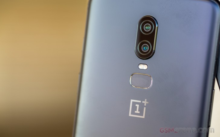
The rear-mounted fingerprint sensor is fast and accurate, and its position is very good, even if it could have been physically taller. The dual rear camera island protrudes a little bit, but thanks to its centered position there's only minimal wobble when you place the phone on a table and try using on it. The worst you'll encounter is when typing letters that are at the far lateral ends of the keyboard.
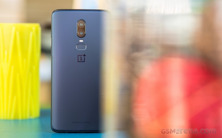
We're not fans of the redundant "Designed by OnePlus" message on the back. All of BBK Electronics' brands (Oppo and vivo alongside OnePlus) have started plastering such inscriptions on their phones this year, and we don't get it. Has anyone ever assumed that a OnePlus phone (or vivo, or Oppo for that matter) wasn't designed by that company? Is this really an issue people had, that needed to be clarified? The inspiration is clear - "Designed by Apple in California but manufactured in China". So why has OnePlus shied away from adding "in China" to its message.
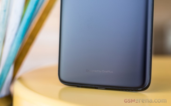
Build quality is exquisite, the OnePlus 6 feels solid, there are no creaks whatsoever. It is a bit top-heavy though, but you can easily alleviate that if you hold it closer to its middle. Both the rear and front glass nicely curve into the metal frame, while the buttons are clicky and feel great to use.
The earpiece is smaller than usual, which will take some getting used to when you're in a phone call - some small adjustments in how you hold it to your ear may be necessary in order to better hear the person at the other end of the line.
The alert slider on OnePlus phones is still unique in the Android world, and it allows you to quickly silence the phone (or turn it to Vibrate mode), without needing to even look at it or unlock it. The slider is somewhat configurable, as you'll see if you go through the Software section of this review, but it may not be as customizable as you'd expect.
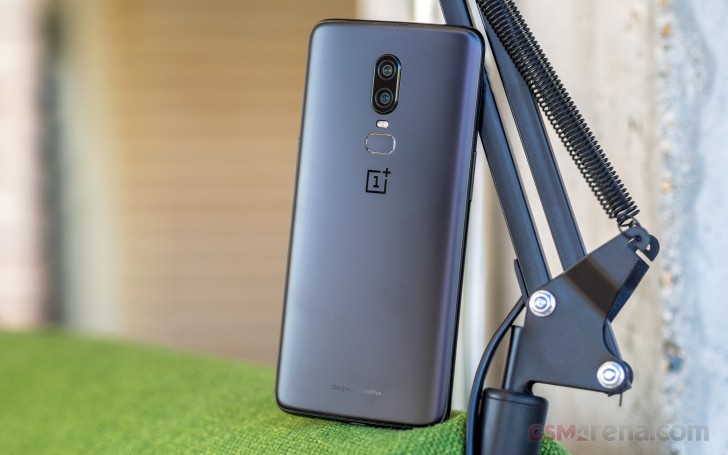
The phone ships with a clear case in the box, but OnePlus offers a selection of much nicer ones if you're willing to spend a bit extra. Wood, nylon, and 'Karbon' bumper cases are options, along with the company's trademark Sandstone finish, and some colorful silicone cases too.
The OnePlus 6 is a joy to handle. It feels premium, as it's got the necessary mix of materials to accomplish that in 2018, and while its design may not be hugely innovative, it works. It's modern enough, but also understated enough to go well with any fashion attire.
OxygenOS
OnePlus' OxygenOS is an interesting beast. Insert obvious joke about it being "a breath of fresh air" here, given the name. While it looks like stock Android, for the most part, it adds quite a lot of functionality on top of Google's vision. There's a lot of that going on in various bits and pieces of the UI, and OnePlus seems to generally be erring on the side of presenting you with more choice. As that was a core tenet of Android's marketing message, it seems like OnePlus is basically out-Googling Google in this respect, especially now that the search giant is taking a more Apple-y approach to software design, removing certain options so as to not confuse normal users.
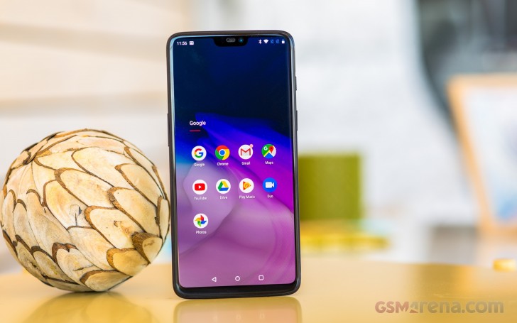
OnePlus' focus, on the other hand, has always been on the enthusiasts. And these are still served well by the latest iteration of OxygenOS. The software is, in a manner of speaking, the best of both worlds. You get the stock look - which means no unnecessary UI changes just for the sake of being different, no bells and whistles that are there only to make this particular skin stand out from what you'd see on a Pixel. At the same time, you also get a lot more customization at your fingertips, something that purveyors of custom ROMs have always appreciated.
It's an interesting mix, and it works. OnePlus isn't messing with any core functionality in Android, it's just adding what are usually neatly thought through options on top. It's not changing the general UI paradigm but is improving it in subtle ways. All of this doesn't appear to come with any performance penalty whatsoever, which is great considering that other UI overlays do add an overhead from that point of view.
There are still things that could be improved, changed, or altogether scrapped. Since it's got such a stock-looking vibe, OxygenOS would do very well to add the Google Feed (or whatever it's called this week) to the left of the leftmost home screen. OnePlus' Shelf is there now, and the good news is you can disable it. The things it contains can easily be found elsewhere - like recent contacts or the memo writing function. Others, like the recent apps section, could have just been added to the top row of the app drawer emulating the Pixel launcher.
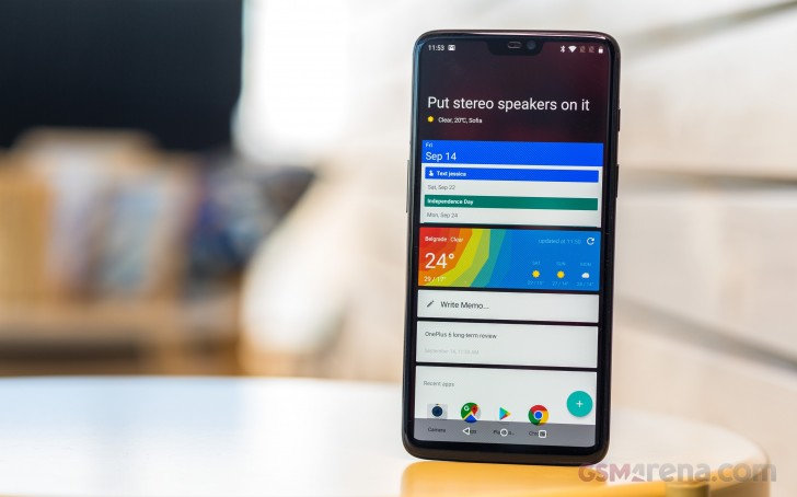
As for membership cards, sure, that's a nice touch, but there are plenty of apps in the Play Store that have that functionality, including Google Pay. And if you use that for contactless payments, why not store your loyalty cards in it as well? Not to mention that if you ever get a phone that isn't made by OnePlus, you'll appreciate the card syncing ability third-party apps provide. When it comes to the Dashboard section, all of that information is accessible through Settings as well, so redundancy is pretty much the Shelf's middle name.
OnePlus also packs gesture-based navigation into the latest stable release of OxygenOS, but unsurprisingly this isn't the same as what Google's settled on for Android 9 Pie. In Pie-based OxygenOS releases you'll get that option alongside OnePlus', yet we can't help to think that the state of gestures in Android is currently pretty messy. Every manufacturer has its own interpretation, and that creates somewhat of a learning curve when you switch devices.
OnePlus goes with swiping up from the middle of the bottom of the screen to go Home, doing the same but pausing for the Recent apps menu, and swiping up from the left or right part of the bottom in order to go back. The system works well, and you'll get used to it in a few days tops, but we're sorely missing an ability to quickly switch to the previously used app.

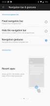
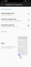

Navigation gestures explained
If you decide to use the legacy three-button software navigation, this is possible if you double-tap on the Recents key. In Google's version of gesture navigation, this is accomplished by dragging the pill icon to the right. Perhaps in future OxygenOS iterations, OnePlus can focus more on this aspect, as it considerably reduces the friction in multitasking.
Our last note about gestures concerns Google Assistant, and the fact that if you opt to get rid of the traditional three-button navigation bar the only way to invoke it is by saying "OK, Google" or "Hey, Google". We're fine with that in private settings, but it could get weird in public.
The OnePlus Switch app is there to help you transfer your data over from your old phone. It failed to connect to the Pixel we tried first but then it transferred all the data from a Galaxy S9+, which we tried next. Unfortunately, no files were transferred - such as photos and videos - but outside of that, after the transfer, the OnePlus phone was usable straight away as it had all accounts.
The OnePlus Gallery app exists, though we're not sure why, in a world where Google Photos is a thing that can do all it does and more - don't forget the free unlimited cloud storage. The same observation goes for the Notes app - wouldn't it have been easier just to include Google Keep? So, unfortunately, OnePlus is also afflicted by the app duplication disease, although it's on an entirely different scale than the likes of Samsung.
There's a built-in voice recorder app, but this doesn't seem to be able to record calls with this latest version of OxygenOS. Sadly, Android Pie has also apparently made call recording much more complicated (if not outright impossible), so this feature will likely be phased out on all current and upcoming phones.
In Settings, OnePlus adds a whole Customization section, and hides some less used options behind the Advanced moniker. That's where you can find nice additions such as a scheduled power on/off, and a toggle for Pocket mode (which prevents accidental screen touches). You can customize the alert slider's behavior, namely what happens in all three of its positions - Silent, Vibration, and Ring. You can not, however, change what each position is - the lowest is Ring, the middle is Vibrate, and the top one is Silent no matter what.
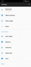


Customization options
If you use the classic navigation bar, you can also customize what long pressing and double tapping on each button do. Double-tapping the screen to wake is an option, and you can draw various letters on the display to accomplish specific tasks, or flip the phone to mute incoming calls and even take a screenshot by swiping with three fingers on the panel.


More customization options
While the OnePlus 6 doesn't have an Always On Display function per se, you can get it to show you such a screen every time you lift it up. Additionally, it will show you every new notification you receive.
Updates
OnePlus historically has been among the fastest to update its older handsets to new versions of Android, but that doesn't mean there isn't any room for improvement. It still takes months for a stable release of the latest tasty treat to make it to a OnePlus handset, unfortunately.
If you like living on the bleeding edge, you can part take in the Open Beta program and test these while they're still in development and bug-prone, but we wish that swifter updates would become the norm. You probably shouldn't expect Android Pie to make it to the OnePlus 6 earlier than December or January. We're basing this assumption on how things have gone in the past but we'd be very happy to be proven wrong.
When it comes to security updates, things aren't great. Our OnePlus 6 is still on the July 2018 security patch level at the time this review's been published. Not one, but two newer monthly security updates have been outed by Google in the meantime. So while you do get updates from time to time, security fixes that actually arrive monthly aren't yet a thing for this model. Maybe in the future.


The current software version
Performance
With a Snapdragon 845 inside, and up to 8GB of RAM, you'd expect amazing performance from the OnePlus 6 - and it delivers. Slowdowns are not something we've ever encountered in our time with it, everything just flies. OnePlus devices have always scored very well in benchmarks (though not uncontroversially at times), but we're not here to talk about that in this long-term review.
What matters to most people is how fast a phone feels in day-to-day use, and we're happy to report that the OnePlus 6 will not disappoint in this regard. No matter what you throw at it, there won't be any hiccups.
Lags are almost nonexistent, and multitasking is a breeze if you can get used to the Recent apps rolodex's scrolling, which feels a bit unnatural. More on that in the Smoothness section.
Smoothness
A big part of what stands out in a Pixel is how smooth it feels in operation, how lag and stutters are nonexistent in day-to-day use, and how it seems to not slow down with time. Well, the OnePlus 6 is incredibly close to that level of smoothness. In fact, it's the closest of any device that's ever been put through the long-term review process. We still wouldn't call it on par with a Pixel, but it's almost there.
To get to 100% two things need to happen. First, improved touch latency. Note that we're not basing this on any scientific measurements, but the OnePlus 6 feels like it's lagging the Pixels when it comes to this. From time to time (or even more often if you're specifically looking for it) you will perceive some small amounts of latency when scrolling, no matter what app you're in.
Speaking of which, the multitasking rolodex's inertia settings need to be tweaked somewhat, because scrolling through it one gets an eerie feeling. It's not just the scrolling itself that's the problem (although that could be a little bit smoother too), but when you want to stop upon a specific app. That action just feels... wobbly, for lack of a better term. You'll constantly be second-guessing whether you were able to stop the spinning at exactly the spot you wanted.

Recent apps
Anyway, props to OnePlus for creating a software experience that not just looks like it's stock, but also feels like it most times.
Battery life
Overall, battery life has been good during our extended stint with the OnePlus 6. The software seems well optimized not to eat away at the 3,300 mAh cell for no reason. What's more, battery life has been consistent, and that's refreshing. We did not experience any weird ups and downs from one day to the next, which is something we, unfortunately, did encounter while putting Samsung's Galaxy S9+ through the long-term review process.
Our normal use case for a long-term review involves the phone being off the charger for 12-16 hours. During that time it's mostly connected to Wi-Fi, with an hour or two of mobile data thrown in for good measure. A few calls here and there, totaling around half an hour. Bluetooth is always on and we stream music for an hour or two tops. Location is on the High accuracy setting, and auto brightness is turned on. We should also mention that we went with the default theme. Because of the AMOLED screen, if you were to choose the dark theme you might squeeze even more from the phone's battery.
With these settings, our record screen on time with the OnePlus 6 was a little over 7 hours going from full to 6% battery left. For such a typical day we've never seen the screen-on time go below 5 hours. If you add more time spent on mobile data, and use positioning apps, then expect that number to go down, obviously. Still, we're happy with the OnePlus 6's battery life, even though there's definitely room for improvement.
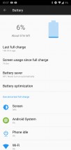
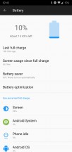
Battery life: Our record • An average day
Given these very good numbers, achieved from a battery that isn't huge by today's standards, we can't help but imagine how much better battery life would be if OnePlus decided to include a 4,000 mAh or even bigger unit in its next phone. Sure, there's always a price to pay with such a move, primarily when it comes to thickness, but since battery life is most people's number one gripe with current smartphones, perhaps that wouldn't be tough to live with, considering the benefits such a move would bring.
The fact that a bigger cell isn't built into the OnePlus 6 is somewhat alleviated by the excellent Dash Charge system, which is among the quickest (if not the absolute quickest) on the market right now. It tops up your battery amazingly fast, so even if you only have a few minutes to keep the handset charging mid-day, that will make a difference. Dash Charge consistently amazed us with how fast it is, but it does come with its own caveat - you need to use the official OnePlus charger in order for it to do its magic.
Camera app
The OnePlus camera app can be brought up by double tapping on the power button, which is a very handy shortcut that is enabled from Settings. What's more, you can even set it so that gesture not only launches the camera, but also quickly snaps a shot. We chose to leave this off because framing on the spot would be difficult, but you may find it useful.
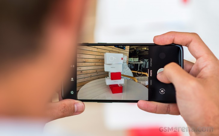
The app is fast and easy to use, but it might take you a bit of time to locate the Settings icon. This isn't available on the default screen, nor can you get to it by swiping to the right from the left edge of the screen to reveal a 'drawer' - there's no such thing here. Instead, you need to do what the little arrow above the shooting modes implies and swipe up from the bottom of the UI (in portrait orientation). In landscape, you swipe from right to left. Once you do this you'll get additional options, such as Slow motion, Pro mode, Time-lapse, Panorama, and even Google Lens. Oh, and in the top right (in portrait) or top left (in landscape) corner you'll finally see a Settings cog icon.
That still won't let you alter too many options. There are a few in there but you can't change the resolution for example. For more personalized shooting settings, you need to head to the Pro Mode, which also supports capturing in the RAW format. As usual for a long-term review, we've used the auto mode, because that's going to be what most people stick with, and we wanted to give you an accurate impression of the quality that the OnePlus 6's cameras are able to provide without endlessly needing to tweak specific settings manually.
Camera samples
In daylight conditions, the OnePlus 6's rear camera system delivers pleasing results. This is definitely the best camera we've ever seen on a OnePlus smartphone. Detail levels are good, color reproduction strikes a good balance between the very trendy vivid look and actual accuracy in what's depicted. But most importantly, the dynamic range is simply amazing. OnePlus achieves this with software (image stacking we're guessing) even when the HDR mode is not turned on.
Here's an assortment of samples.


OnePlus 6 daytime camera samples
Usually, when you see a handy 1x/2x selector in a camera app, it's there because the phone in question has a secondary zoom lens on the back. That's not the case for the OnePlus 6, but it still offers that quick switching mode at your fingertips - you can go from 1x to 2x zoom with just one tap. Don't be fooled by the button - this is digital zoom through and through. Pictures snapped in this mode aren't very bad, but the quality obviously can't match what would be produced by an actual zoom sensor.


OnePlus 6 camera samples with 2x zoom: Off • On
When ambient light levels drop, the OnePlus 6's main camera array is still capable of producing some very nice shots, as you can see below. Saturation of the colors remains surprisingly good, and the dynamic range continues to be stellar. The optical image stabilization clearly helps a lot in such conditions and almost all photos we took after dark were nice and sharp.


OnePlus 6 night-time camera samples
Selfies turn out very good in decent lighting conditions, they're sharp, with accurate skin tones, and plenty of detail. When you try and shoot them in the evening, results will be mixed, based on the light sources around you and whether the screen-based 'flash' can actually help light your face up enough.
Portrait mode for selfies is an option too, and it works reasonably well, though as usual with most phones even the smallest of stray hairs could get blurred.
All in all, the OnePlus 6 has definitely upped the Chinese company's camera game significantly compared to any of its predecessors. Its snappers are still not on par with the best the mobile world has to offer if you are examining photos on the computer screen, but they surely are punching above their weight and look gorgeous on that AMOLED screen.
Annoyances
The OnePlus 6 isn't perfect, and that's okay because no smartphone has ever been. Here's a quick list of things that frustrated us while we were using it as our one and only mobile device.
First off, the small notch seems to have impacted the reliability of the proximity sensor. This is the one in charge of turning the screen off when the handset is close to your ear, while you're talking on the phone. Countless times we found the screen turning itself back on. Not only that but the notification area was already swiped down in many such instances. We assume we were able to do that unwittingly with our ear.
There's a really narrow sweet spot for the proximity sensor, where it doesn't do this, and it's been a hassle to figure it out every single time we've been on the phone. We're not sure whether the sensor is simply too small or if it's just its position that is to blame, but keep in mind that you may have to do a constant phone repositioning dance while you're engaged in conversations, if you don't want your ear tapping and swiping things on the screen.
To answer an incoming call, by default you swipe down, which is a bit counterintuitive for two reasons. First, this is not how most companies do this, and second, there's less room for a downward swipe than there is for an upward motion. Thankfully though, this behavior can be altered from the Phone app's settings.
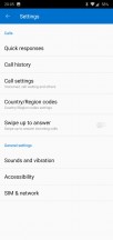
Swipe up to answer is an option
Android Oreo has dots that show up on top of an app's icon when you have a notification created by that app, but for some reason, OnePlus takes dots even further. Every time you install a new app it will have a blue dot to the left of its name. This goes away when you first start that app from the home screen (note: you have to tap on the icon on the home screen, other methods of going into the app have no effect). Alternatively, the dots go away on their own after a few long days.
Let's just say that if you're suffering from even a mild form of OCD this has the potential of really messing with you. We honestly don't get why this exists, or why it's not possible to turn off this behavior. After all, OxygenOS gives you plenty of customization options, but this just isn't one of them. You're stuck with the blue dots unless you decide to use a third party launcher.
While we're on the subject of OnePlus' built-in launcher, another odd thing is how it handles folders. Usually, when you tap to enter a folder that's on your home screen, its contents would open up right there where it is positioned. Not so in this case, the apps in each folder will always show up in the lower part of the screen. This is one of those decisions that we can't really wrap our heads around.

This is how any folder looks on the inside
Bluetooth sometimes needs two tries to reconnect to previously paired devices, but this is something we've encountered with most Android phones that have gone through the long-term review process, so the problems may be buried deep within the OS itself. Car Bluetooth systems are the ones we've mostly encountered this with, but even with Bluetooth speakers, there's sometimes a lag of about a minute from the time you turn the accessory on to when the connection finally happens.
Finally, we would have appreciated an option for Wi-Fi to turn itself off after a specific amount of time passes with no networks connected. Conversely, turning itself back on when you're near the location of a saved network would be very handy as well. Some of OnePlus' competitors have some variation of one or both of these functions, so maybe the next iteration of OxygenOS might include them.
Conclusion
OnePlus isn't the new kid on the block anymore. The company is now all grown up, and that's reflected very well in its latest smartphone. While it's the most expensive OnePlus ever, it's still quite far from the usual pricing level for a top of the line handset in this day and age.
Once again OnePlus offers a more affordable package than its biggest competitors, but this time around without any glaring omissions or show-stopping compromises built-in. It's not a perfect device, obviously, because such a thing hasn't been invented yet.

The camera quality, while much improved from previous OnePlus phones, still isn't quite on par with the best that the mobile world has to offer. The secondary rear camera seems to be there just to make sure that no one slams the OnePlus 6 for not having a dual sensor array. A wider-angle cam or a telephoto option would have been much more useful day to day, but for some reason, OnePlus chose not to go either of those routes.

Some will hate the notch, but it can be 'hidden' in software, and otherwise, the display is very good, despite not being the best we've ever seen. The alert slider is still a unique feature in the Android world, and the 3.5mm headset jack has thankfully been spared (for now).
Performance is excellent, and OxygenOS has come a very long way in recent years. No bugs anywhere to be seen, and the entire experience of using this phone is surprisingly smooth for something that isn't a Pixel. Battery life is very good but there's definitely room for improvement there - maybe OnePlus can learn a thing or two from other companies finally starting to cram 4,000 mAh cells in flagships too, not just mid-rangers. Dash Charge deserves a mention here as well because it's one of the fastest systems on the market right now and will top up your handset in no time.
Even if some downsides exist here and there, overall the OnePlus 6 is a complete package. It may not shine exceedingly bright in any one area, but it's a well-rounded smartphone that will suit almost anyone very well. Buy one and you're guaranteed a pretty much frustration-free experience. Oh, and you'll still have some cash left over in your pocket for other things if you chose it over one of its much more expensive competitors.


0 Comments